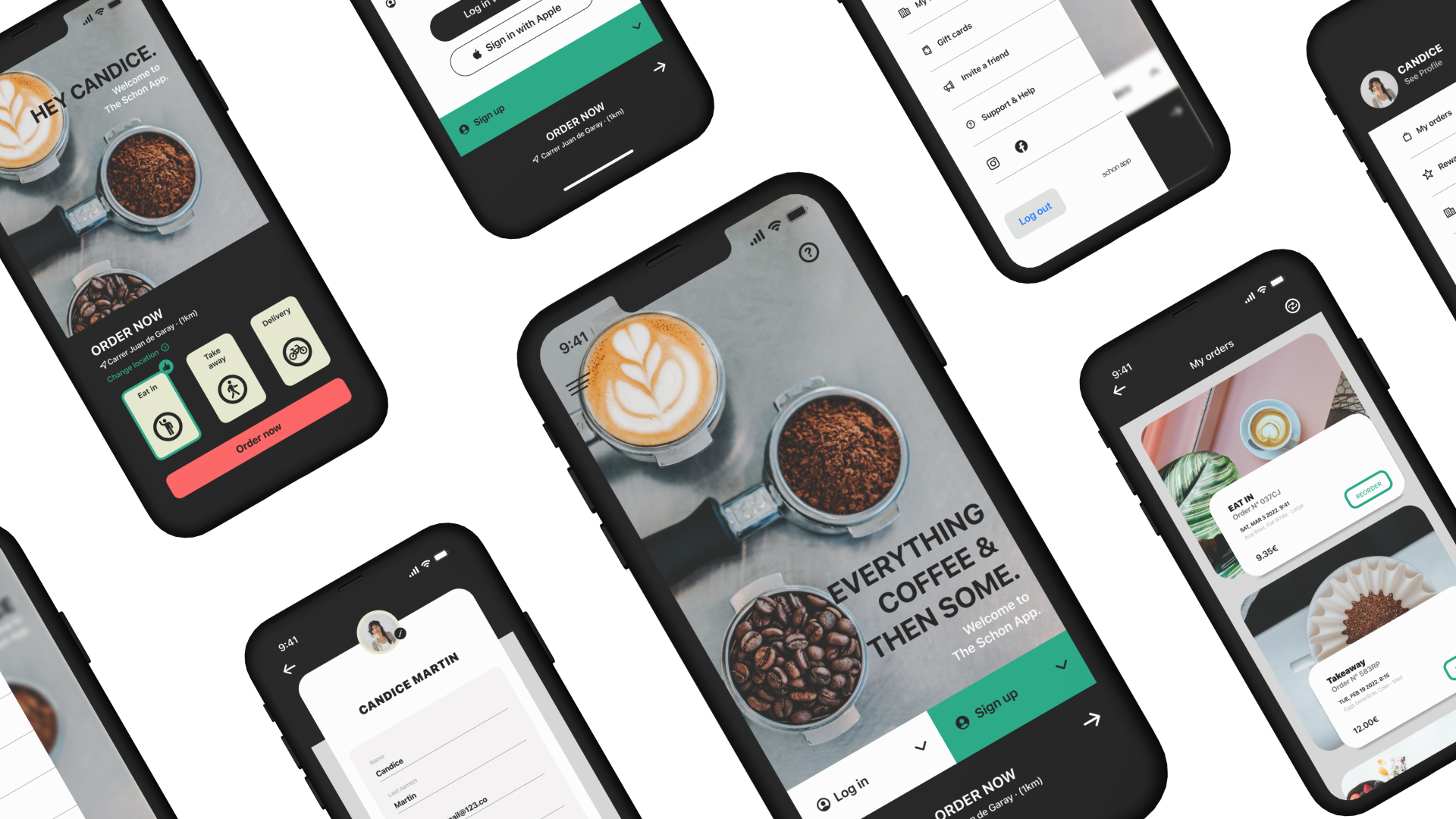
SCHON
The app, named "Schön," is inspired by a song that resonated with me throughout the design process. In German, "Schön" means "beautiful," reflecting the essence of this project.
Through this experience, I explored human nature, everyday moments we often overlook, and the influence of design in our lives. UX is more than just creating apps or websites—it’s about crafting a meaningful experience.
-
Designing an app for a local cafe in Barcelona, Spain.
Project duration: January 2021-February 2022
-
To design an app for professionals to monitor their orders for either eating in, takeaway or for a delivery service
The goal: To learn what users are looking for, design and ideate around that feedback and deliver a fantastic product
-
Lead UX Designer, UX Researcher
My responsibilities: User research, wireframing, prototyping, usability studies, affinity diagrams, synthesising feedback, hi-fi wireframes, mockups and prototypes, delivery.

User research
I conducted interviews and created empathy maps to gain deeper insights into the users I’m designing for, focusing on their behaviors and needs. One key user group identified through this research is working professionals who rely on accurate food and drink delivery tracking apps for both professional and personal catering needs.
This user group confirmed some initial assumptions but also revealed new insights. Research showed that while timely delivery is critical, issues like false advertising and accessibility challenges significantly contribute to user frustration with existing products.

Pain points.
1. Time
Some users expressed concerns about not having enough time to select, order, and pick up their items during breaks.
2. Accessibility
Our research highlighted the need to prioritise accessibility in every design decision to ensure the product is usable by everyone.
3. False-advertising
Users shared their frustration with receiving incorrect orders and with images on apps or websites that did not accurately represent the products.

Personas: Linda
Problem statement:
Linda is a project lead who needs to make orders for food/drink easily and efficiently because she runs the risk of losing her table when queueing.
User journey map
Mapping Linda’s user journey revealed how helpful it would be to have a dedicated app for ordering and tracking items.


Personas: Ade
Problem statement:
Ade is a junior employee a quick, reliable way to track and manage orders from lots of co-workers at one time because In store purchases are too unreliable and succumb to environmental issues (eg. queues)which was Ade’s time.
User journey map
Mapping Ade’s user journey revealed how helpful it would be to have an inclusive app for ordering and tracking items for people with hearing impairments.

Starting the design
Paper wireframes
Digital Wireframes
Low-fidelity prototype
Usability studies

Paper wireframes
The initial paper wireframes highlighted areas of the design that needed improvement and provided an opportunity for exploration. Structuring the wireframes based on instructional content brought back memories of high school art classes, even after years of working in other industries. My storyboarding skills from film school were especially valuable during this process.


-
![]()
Digital wireframes
From our paper wireframes and the user testing that we conducted, we went ahead and outlined what our digital wireframes would look like and what considerations we would be inputting.
-
![]()
The digital wireframing process was a fantastic learning curve, took many iterations and while not perfect, were a way to learn the ropes about taking ideas from paper into digital form.
-
![]()
-
![]()


Low-fidelity prototype
In the early iterations of the low-fidelity prototypes, the user flow is straightforward. It guides users from the landing page to the registered user landing page, then through the menu, confirmation screen, and order receipt.
Usability study: findings
Round 1: findings
Managing the cart needed adjustment
Ordering without registering needed to be streamlined
A confirmation page update needed implementation and to add additional products
Round 2: findings
The settings buttons needed to be more inline with the design
The colour selections needed adjustment on the landing page
The section with previous ‘my orders’ needed better alignment
Refining the design
Mockups
High fidelity prototype
Accessibility
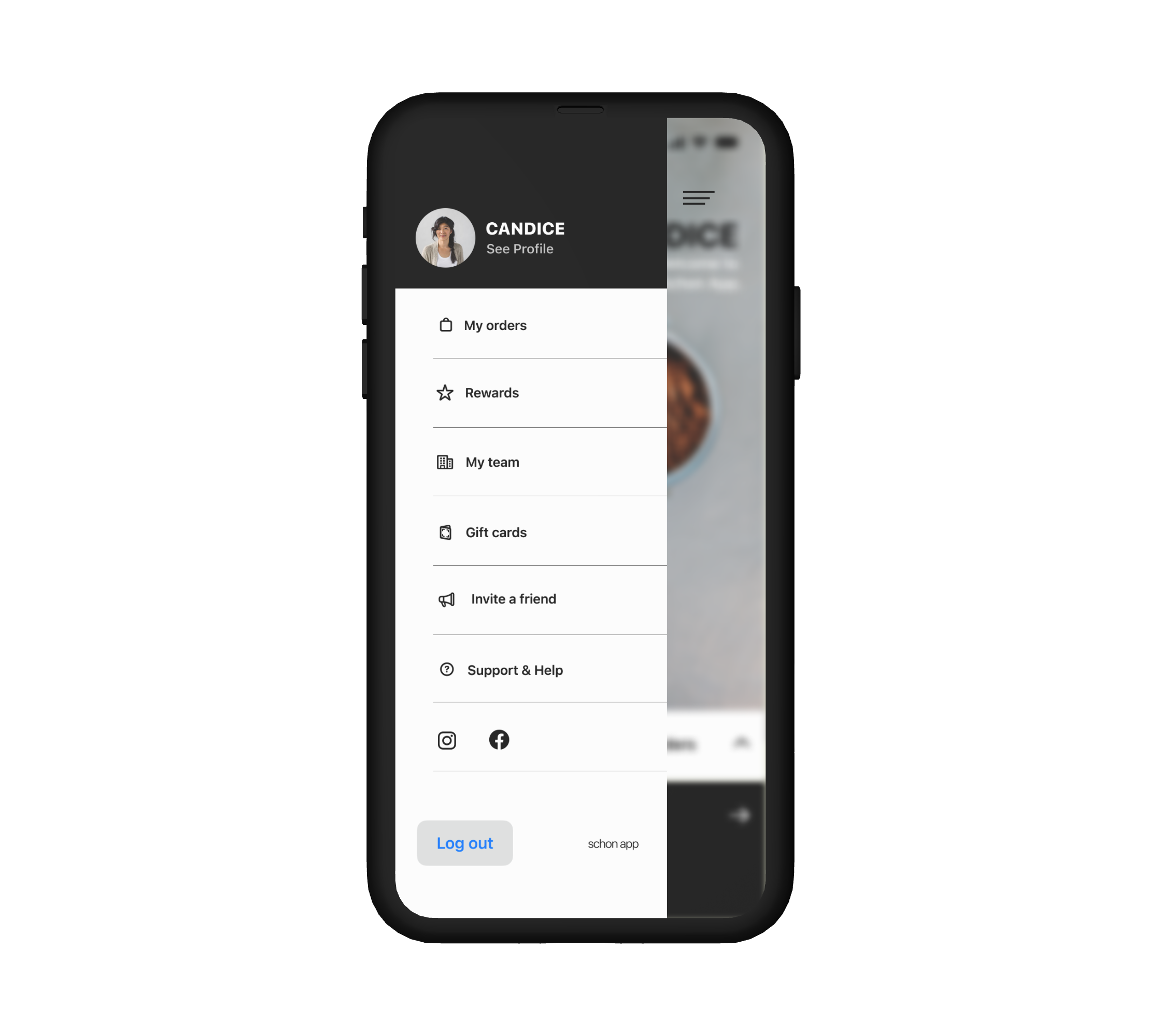
Mockups
Creating the digital mockups was an exciting milestone in the process. After months of learning about UX, this moment felt like the culmination of everything I had worked on.

Before usability study

After usability study
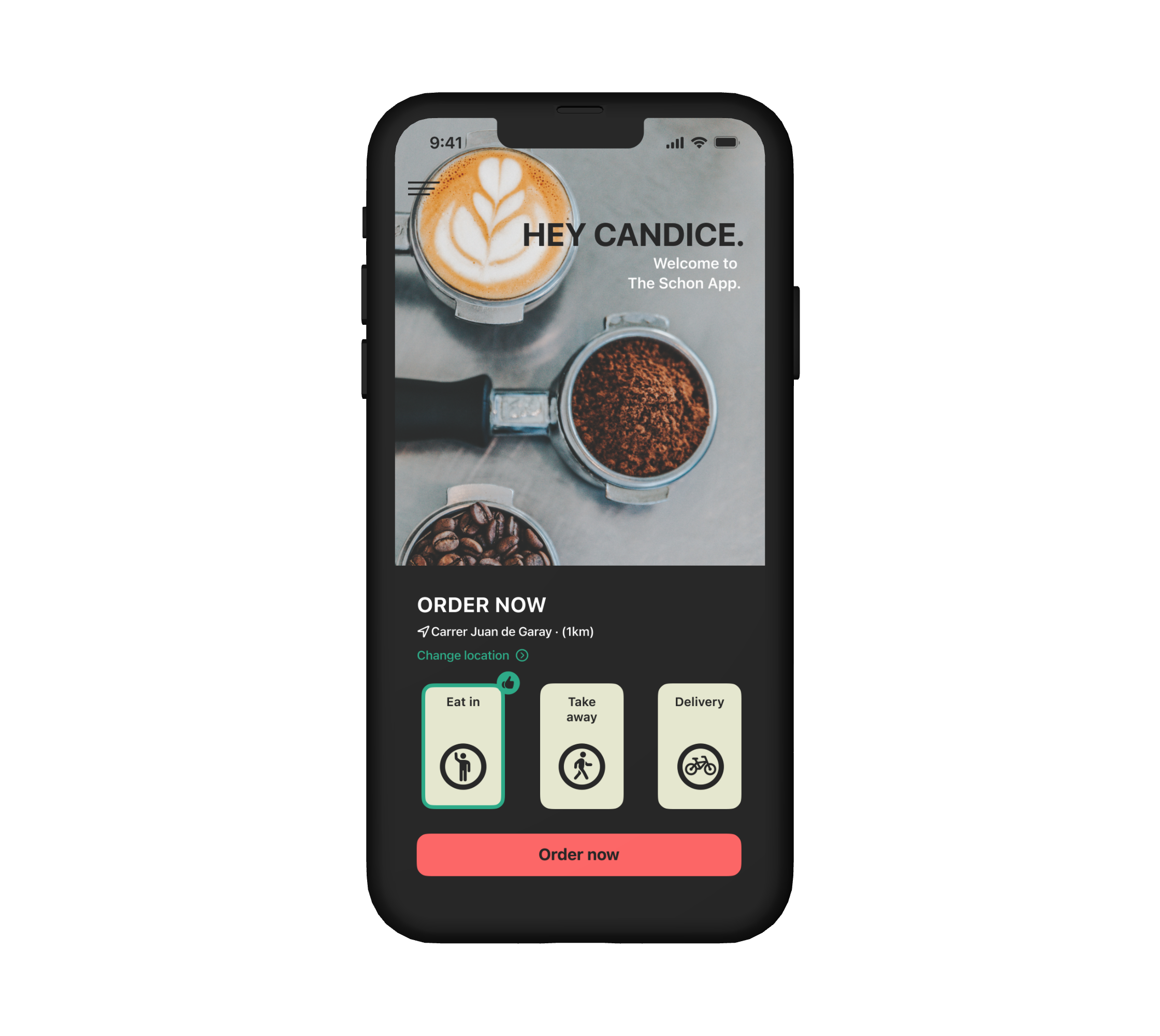
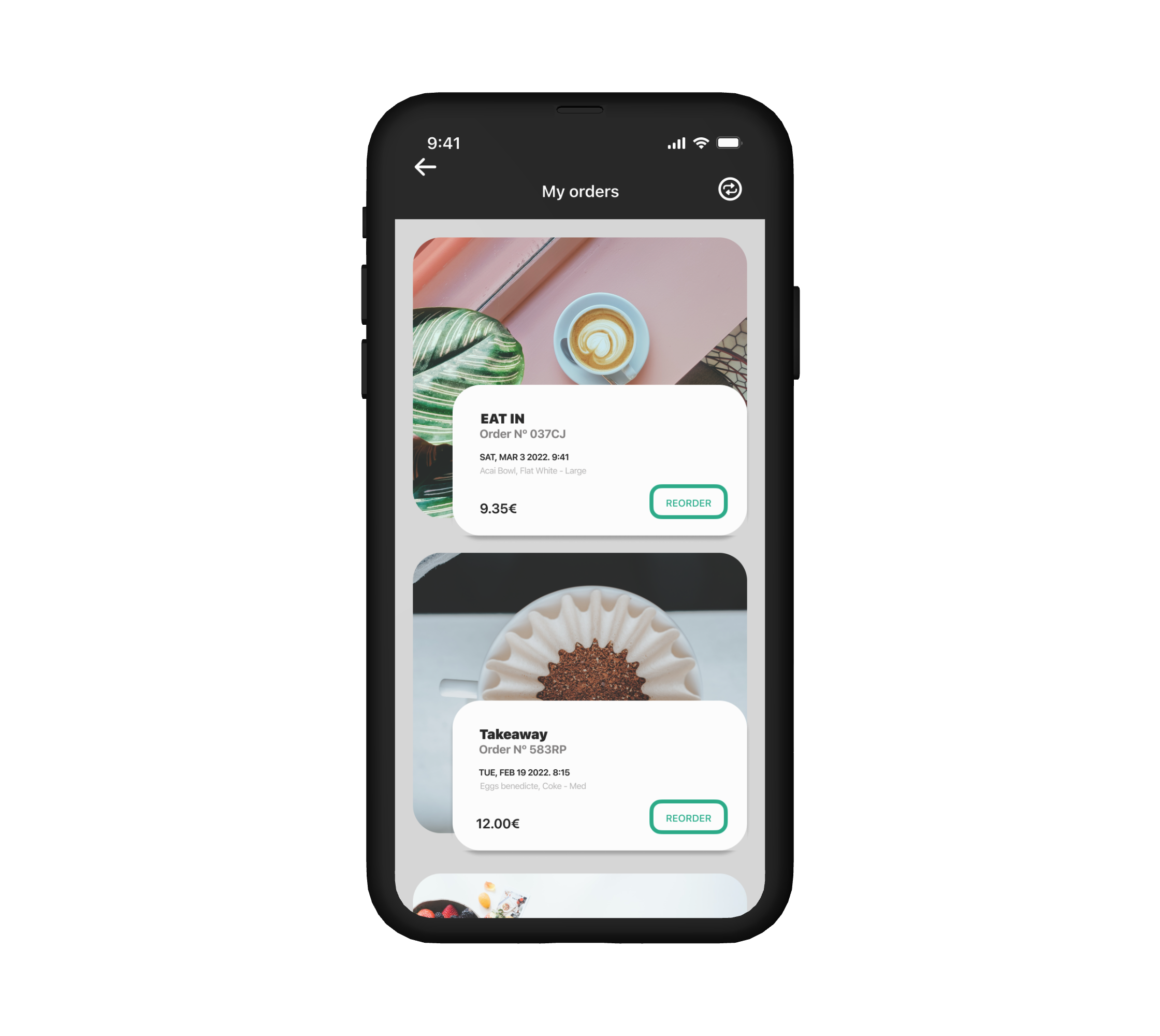
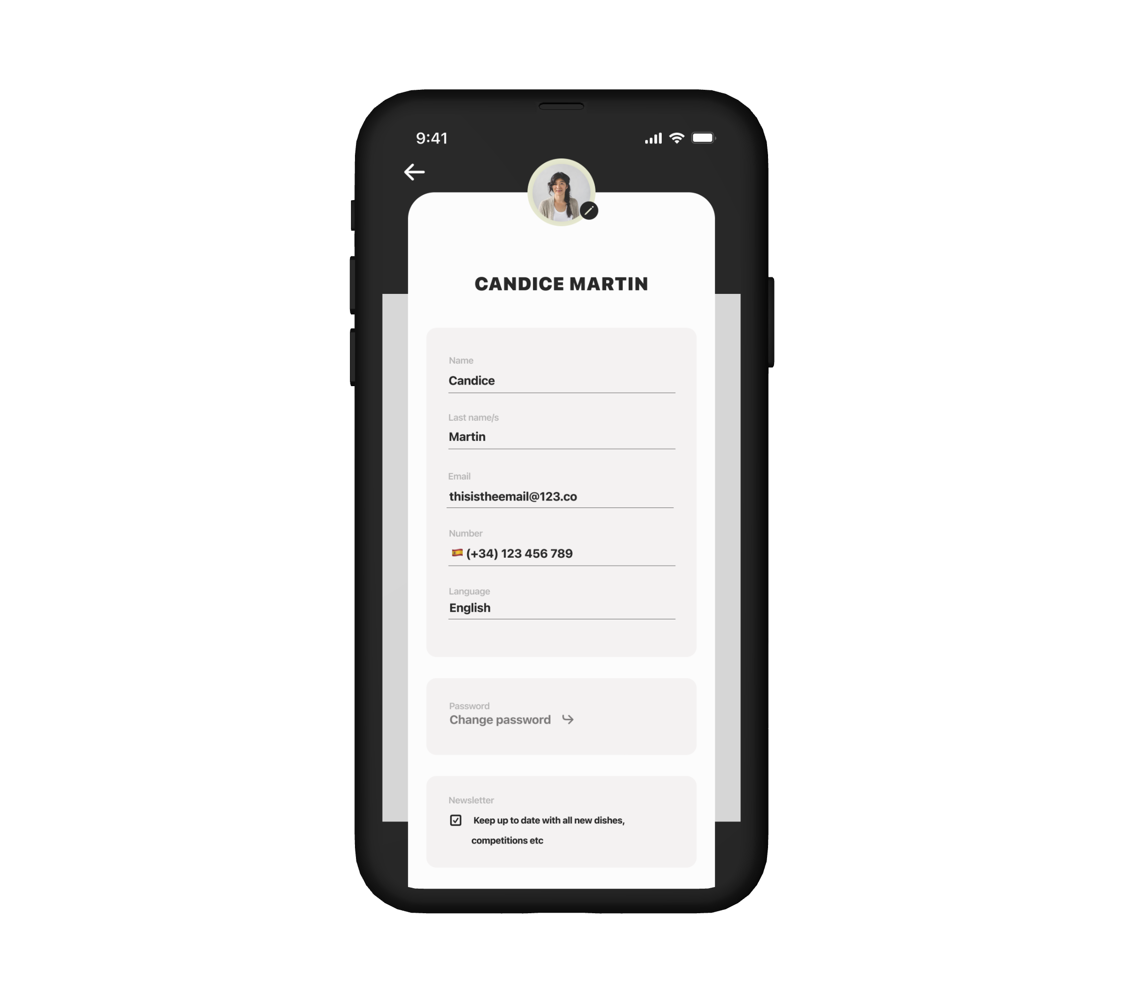
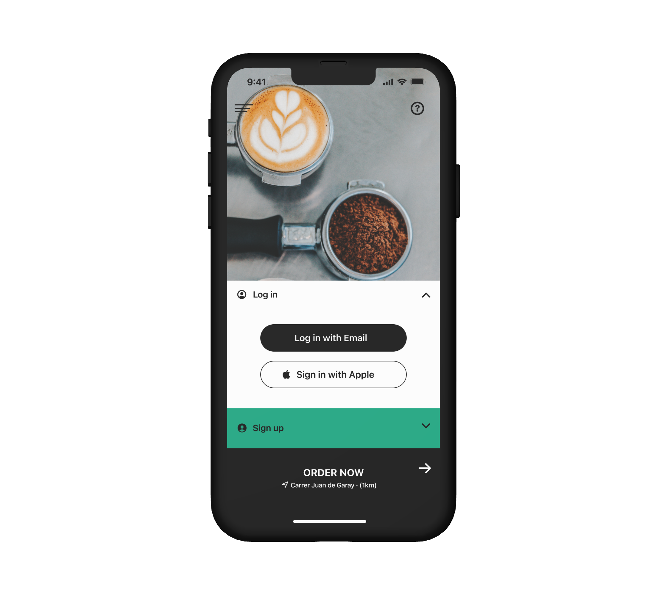
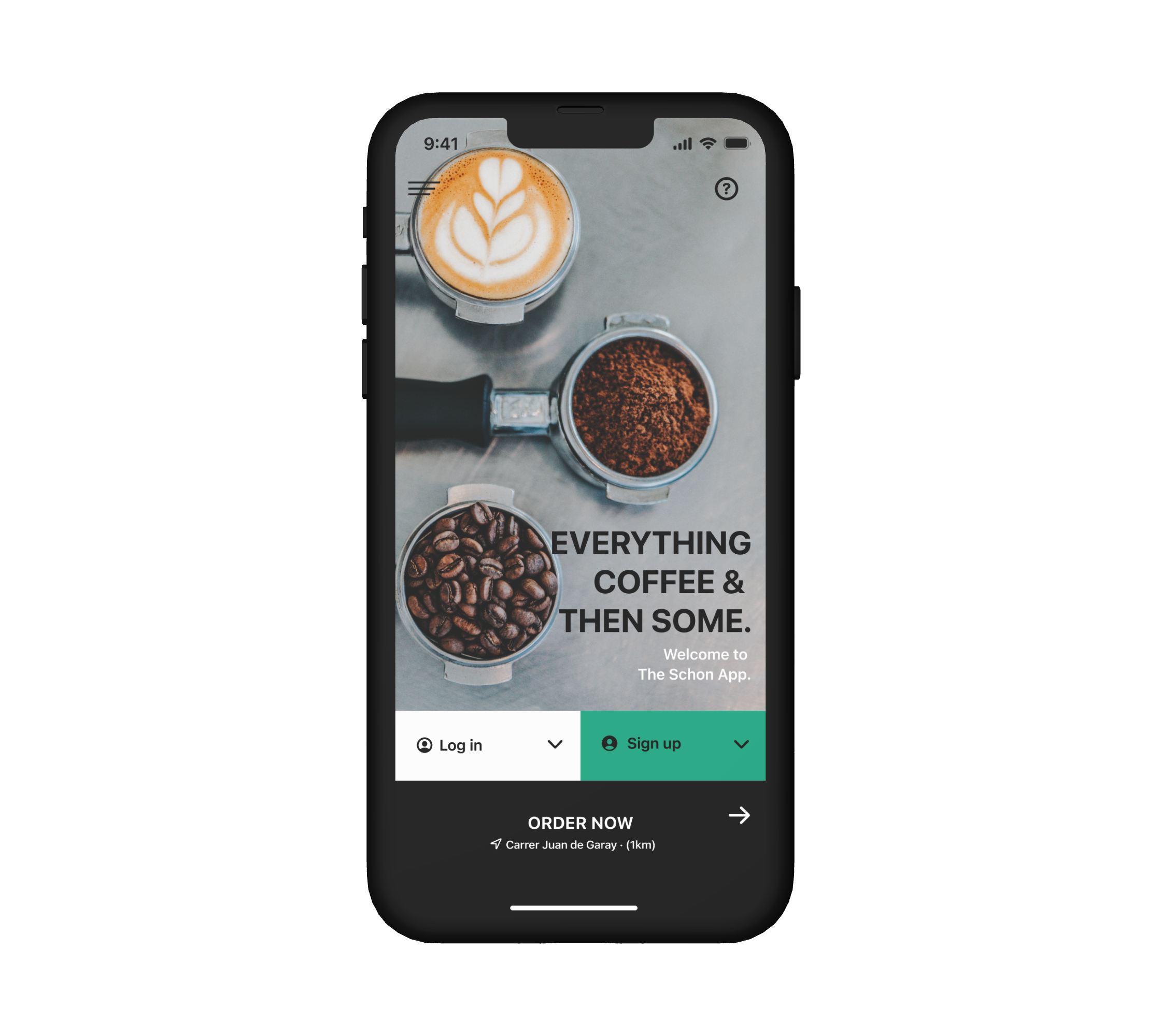

High-fidelity prototype
In this prototype, the idea was to allow test-users to see and experience the ongoing design work, allowing for moderated and unmoderated usability studies.
Accessibility considerations
1. Images will have smart text embedded in them to ensure that people who are needing a screen reader, for example, can fully understand the contents of the pages in our app.
2. The colours used throughout the app were checked and matched correctly using the available accessibility websites that check that colours are the correct hue for all users.
3. Icons were used as well as simple clear text so that users understand the various buttons and what they do.
Going forward
Takeaways
Next steps
Impact:
This has been an incredible learning curve. The very first try at anything UX related was a challenge and it has been a wonderful few months. The process was rewarding and I have taken so many new skills and considerations onboard.
What I learned:
To design with accessibility in mind is to design for the few but for the benefit of many.
Takeaways
Next steps…
In undertaking the various implementations that were brought about from our second round of usability studies, these changes were vital to project viability as feedback is essential.
In making this project the best that I can, I have to have understood that the process is not quite as simple as I thought and that ideating updates and new features are an integral part of professional UI work.
With this project and the successful completion of my mockups and hi-fi prototypes, in moving forward, the idea is to gain new insights from the public. This body of work will remain available online with the spirit of collaboration and interaction.
Let’s connect.
Thank you so much for taking the time out of your day to look through this body of work. Should you wish to get hold of us, let’s connect.
rpmdesign.ux@gmail.com
London, England.